Company: LiveHealthily - formally, Your.MD
Role: Head of UX : App / Website / Marketing
Duration: 1 Year, 2 months

Overview
During my tenure as Head of User Experience at Healthily, a medically approved self-care app with the mission to help a billion people find their health through self-care, I oversaw the UX strategy and execution across the company's core divisions:
Healthily App, Website, Marketing initiatives,
and the AI symptom checker, DOT.
My responsibilities included leading a team of designers, driving a research-first mindset, fostering cross-functional collaboration, and elevating the user experience to improve acquisition and retention.
The key challenges
Empower users to take control of their health through self-care
Enhance user’s health overview
Clear health insights through habit tracking and medically approved info
Streamline user experience
Reduce friction in onboarding, key user flows and symptom checking
Strengthen brand consistency
Ensure a cohesive brand experience across all touch points
Build stronger user retention
Enhance user engagement and encourage long-term use of the platform
Improve user acquisition
Optimise the app and website to attract new users effectively
When I joined, we struggled to persuade C-Level to hire a dedicated researcher. This led us having to up-skill the UX and Product very quickly to run regular qual tests to validate concepts !
Improve build efficiency
Enhance processes and tools to accelerate product development
Our approach & key initiatives
We adopted a user-centered design approach, heavily relying on research and data to inform our decisions.
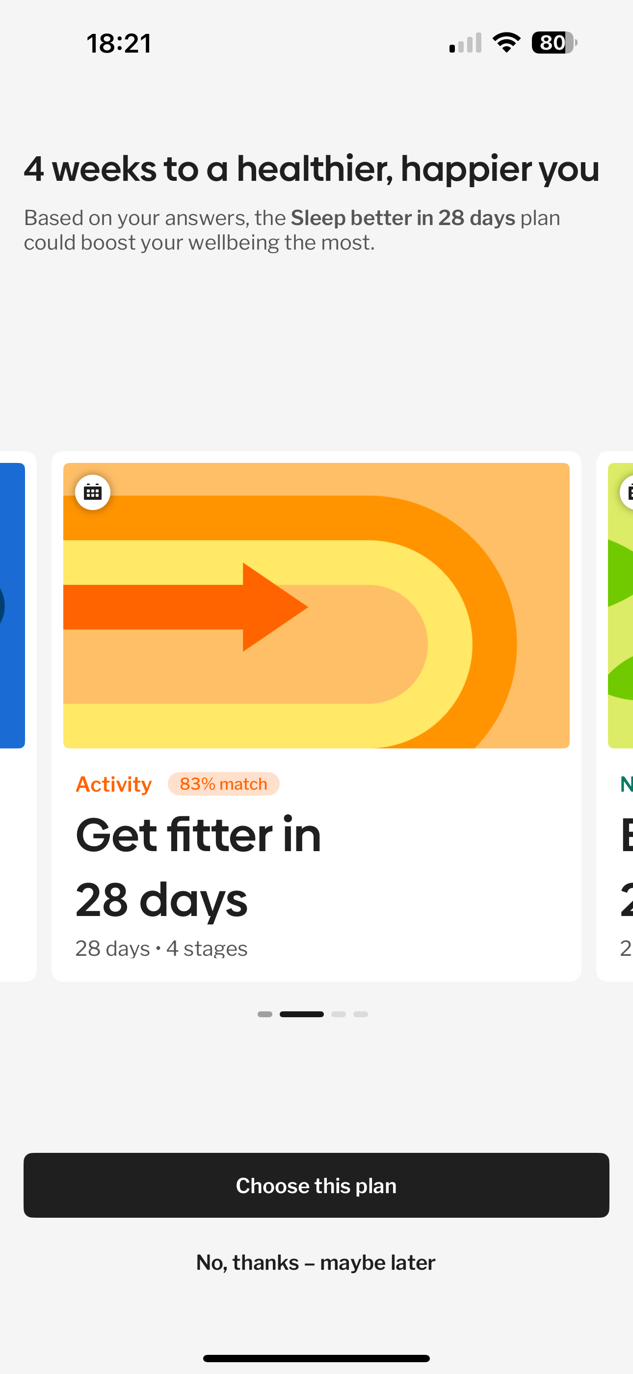
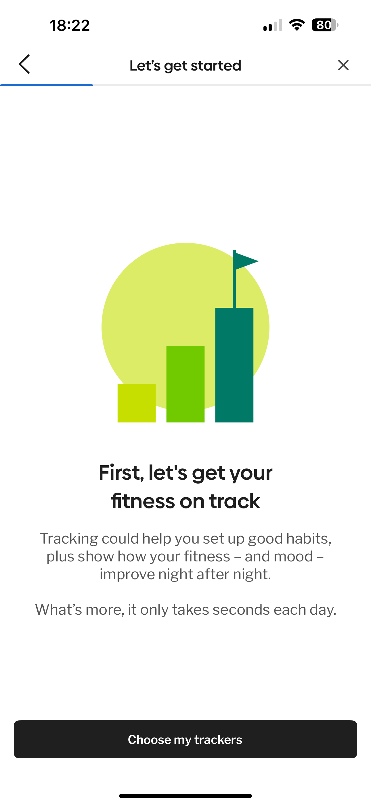
Onboarding optimisation
Iterated onboarding flow based on user research and data analysis to minimise drop-off rates. (KPI: improved onboarding completion rate).
Reduced
20% drop-off rate
during my
1st month by 10%
with a redesign

7-Day retention strategy
Focused on building engaging experiences within the first week of user adoption to encourage continued use. (KPI: Increased 7-day retention rate).
We introduced
a daily health-tip
via push notification that increased
engagement
Engagement strategy
Designed tailored engagement experiences based on the user's journey,
incorporating daily tracking and relevant assessments
Marketplace development
Conceptualised and initiated the development of a telehealth marketplace redesign (with contractor) within the medically approved website offering, strategically integrating relevant products within the app - qual tested.


Information architecture (IA) redesign
I was directly responsible for the IA redesign of the Healthily website, aiming to improve navigation and information findability.
Wireframing & Prototyping:
Created wireframes to visualize the new structure and user flows.Design Oversight:
Oversaw the visual design and implementation of the website redesign.Web Chatbot Research:
Conducted early research to assess user interest and needs regarding a potential web chatbot feature.

DOT Chatbot reimagined
I conducted research to understand user needs and improve the engagement and utility of the
AI symptom checker.
App redesign
Worked with Head of Design to spearhead a redesign of the Healthily app to strengthen brand awareness and establish a scalable foundation with a new design system for faster feature implementation.
Cl;ick to enlarge

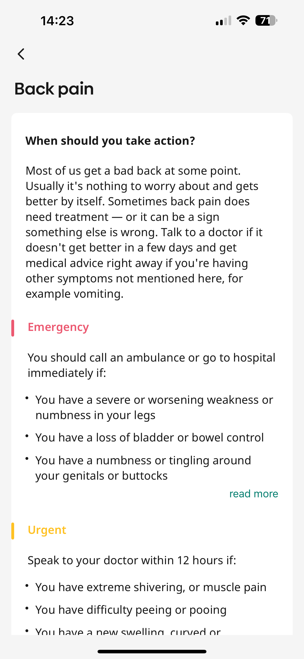
Back Pain Hub
Led the discover, early research and prototyping efforts to investigate how back pain could be solved at 1stage developments. Worked alongside Product Manager, who also happened to be Doctor.
Subscription model enhancement
Explored and refined the subscription offering to provide access and relevant content (£3.99/month).
Mapped out and user tested various user journeys for early stage diagnosis
Worked alongside clinicians to recommend ‘recovery plan over 3-stages’
We created, with the help of clinicians, a series of videos for back exercises,
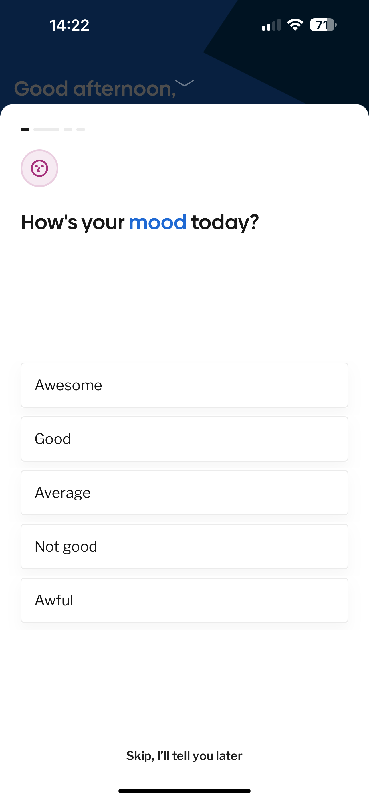
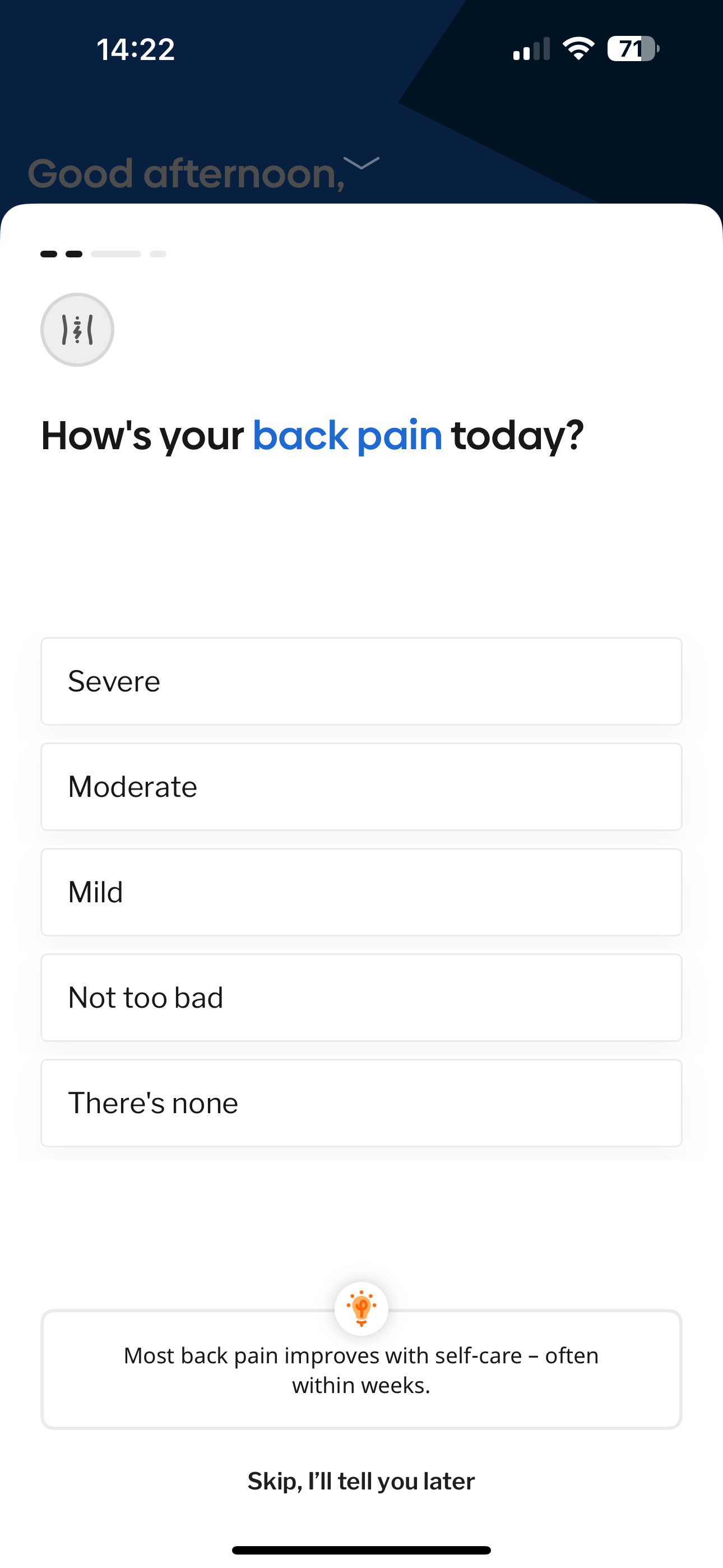
as well as supporting editorial medical contentWith the add of the ‘daily symptoms tracker’ feature, and the inclusion back pain symptoms - we were able to guide the user to document 2x things daily:
how you feeling today
how you feeling after engaging + with the recommended plan
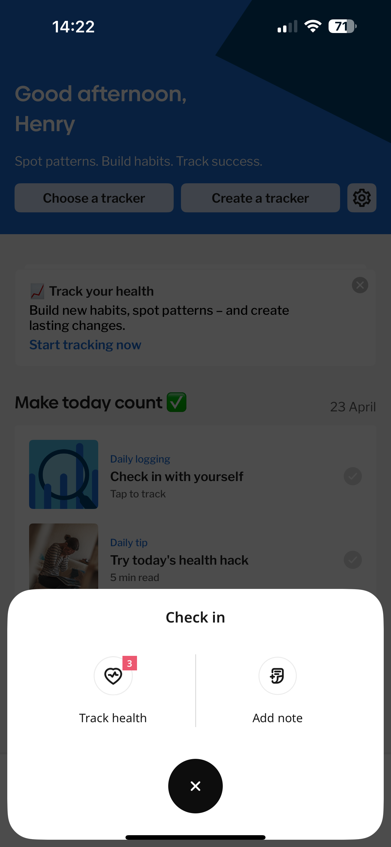
Home dashboard
Content based on user experience with the app and learning
All my trackers
User able to see last 7-days
at a glance
Back pain daily tracker
User able to set a goal,
and also change in future
Recommended activity
Editorial content and video instructions assitsance
Support and guidance
Recommended and clinically approved triage content
Additional learning
Recommended articles based on
your onboarding criteria
Daily tracking
Home dashboard
Content based on user experience with the app and learning

All my trackers
User able to see last 7-days
at a glance
Back pain daily tracker
User able to set a goal,
and also change in future
Recommended activity
Editorial content and video instructions assitsance
Support and guidance
Recommended and clinically approved triage content
Additional learning
Recommended articles based on
your onboarding criteria

Key findings from Data Analysis
+10%
Videos + library not discoverable
BPH Hub library opened by 10% of users
Videos opened by 20% of users)
-73%
drop off after ‘hub uvp screen’
A/B test on hub uvp screen in progress
Need to address hub safety page

-77%
drop off at the paywall
Can we do an A/B test where this is better placed
Testing copy on that screen

Select a goal / plan
Coaching
set goal plan / track daily progress / encourage if sessions missed / educate through learning / reward moments of delight
What does success look like
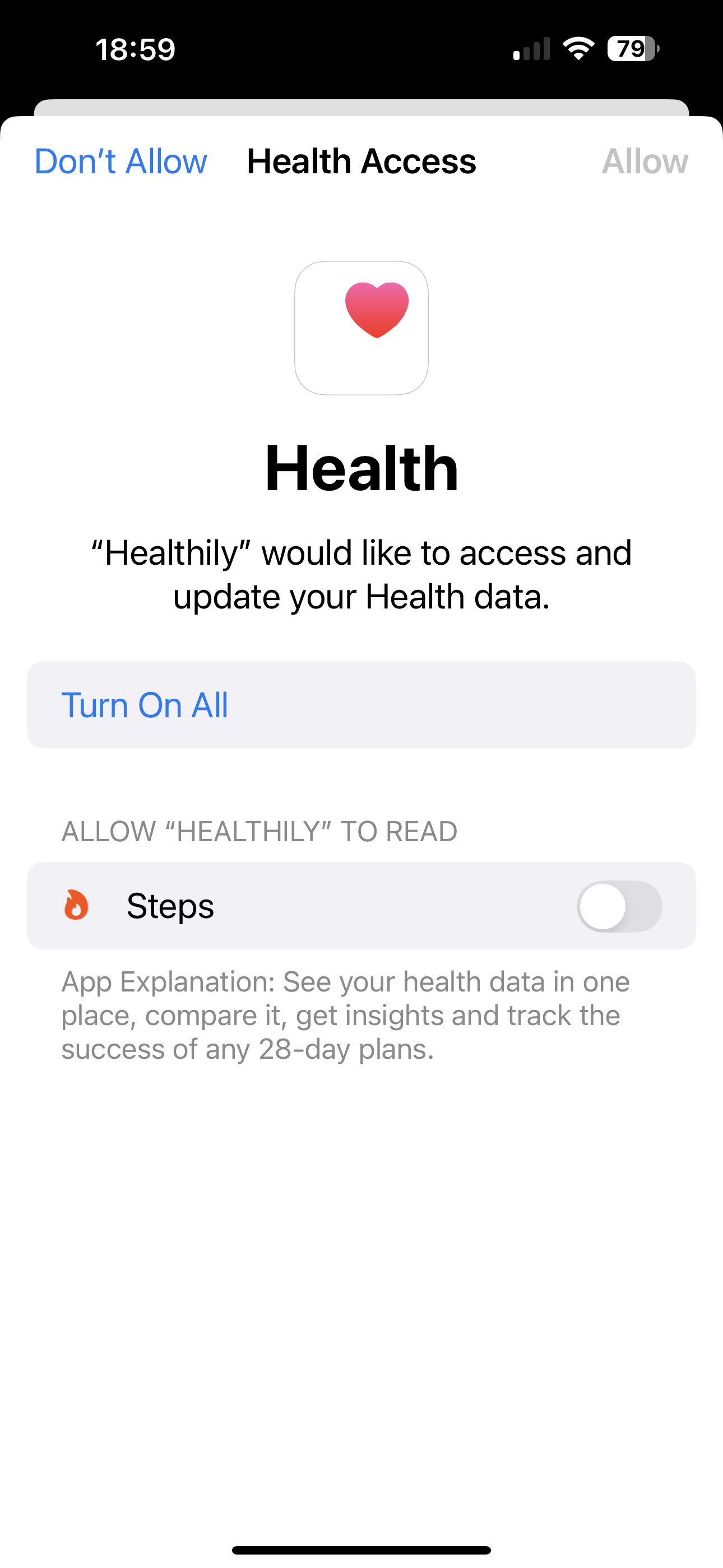
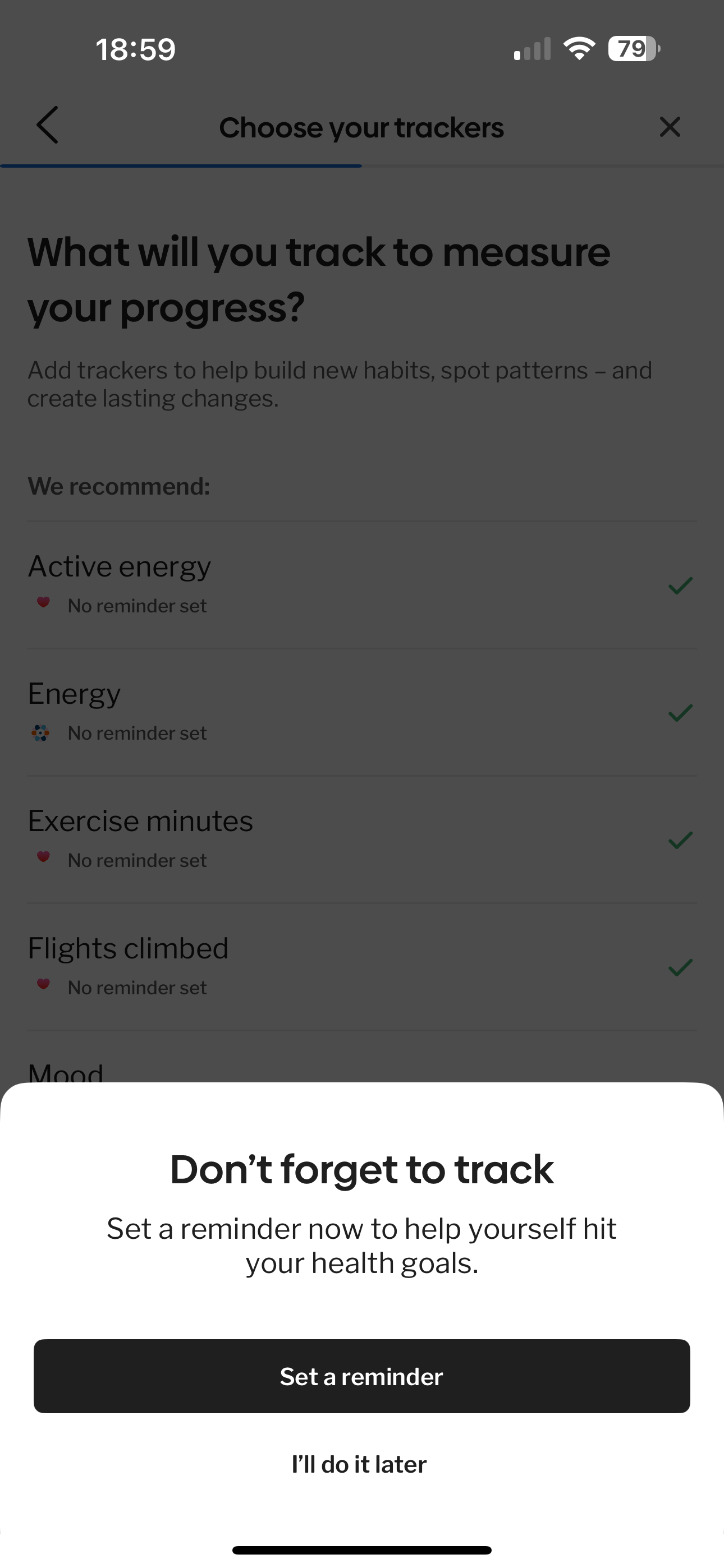
Connect your fitness device
Select trackers
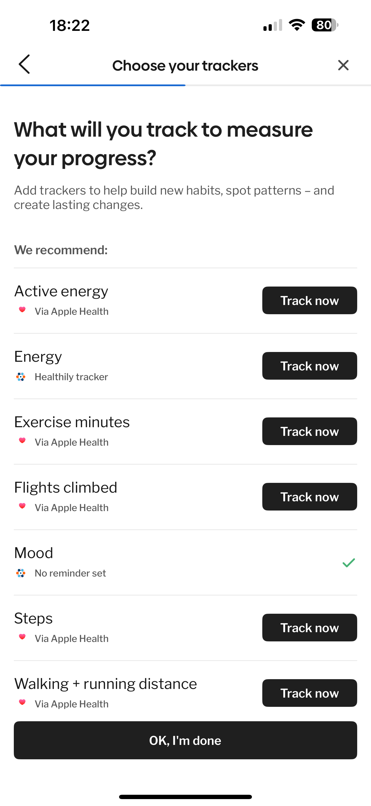
Connect and share data
Set up reminders
Measuring success
Research capability building
Implemented a structured approach to user research, including training the team on methodologies and establishing a centralised documentation system in Confluence.
Qualitative research
Regular user research sessions conducted weekly via UserTesting.com provided valuable insights into user behavior and pain points.
Quantitative analysis
Continuous monitoring of key user funnels and relevant metrics provided data-backed evidence of improvements.
NPS & customer reviews
Tracked Net Promoter Score and analysed customer reviews to gauge overall user satisfaction and identify areas for enhancement.
Key UX reasearch learnings
Early-Stage Exploration:
Employed guerilla testing, workshops, and design sprints (5-day) to quickly explore ideas and gather initial feedback.
Remote Collaboration:
Leveraged Miro extensively for collaborative activities due to remote work during the COVID-19 pandemic.Qualitative Depth:
Prioritised in-depth qualitative research using UserTesting.com to understand the "why" behind user behavior.Team Empowerment:
Focused on training the design team in all aspects of user research, from script creation to analysis and presentation.Knowledge Management:
Successfully implemented Confluence as a central repository for all UX and research documentation, ensuring knowledge sharing and future reference.
